TK Hibiscus
A Tea Brand with Serious Flower Power
Identity | Messaging | Packaging | Website Design
Project – Branding and label design for a hibiscus brew startup.
Strategy and Creative – TK Hibiscus and K+L have been mixing it up since the herbal experts came to us in 2012.
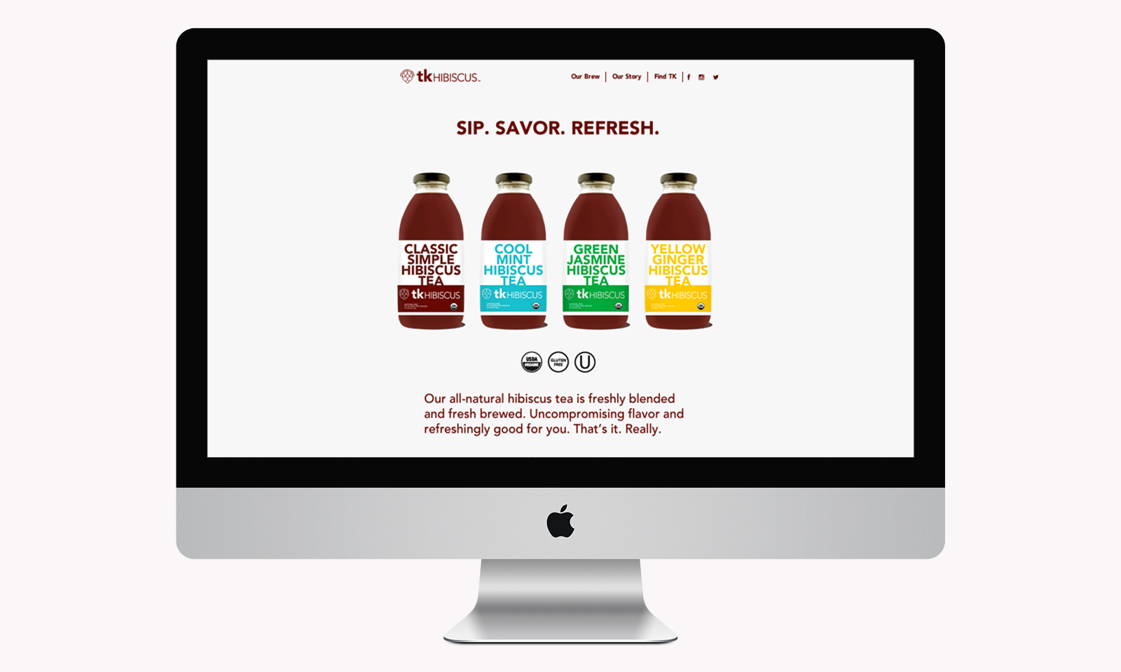
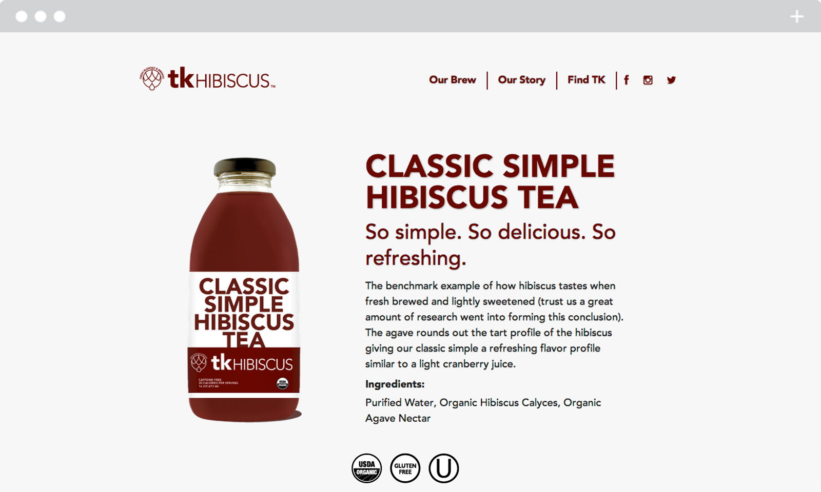
Amid a saturated market of overly elaborate and hard to understand products. We conceived a position and design strategy steeped in clarity and simplicity.
Rejecting flowery imagery employed by so many brands in the category. We leveraged the product description as the title for each beverage. The bold typographic approach became a key point of difference in the cooler case landscape.
Results – Grocery buyers and consumers a like have gravitated to the brand. TK is rapidly growing shelf space and market share as it becomes available across the country.
“Nailed it” – Bevnet